Flex Kullanım Örnekleri
Örnek 1
<!DOCTYPE html>
<html>
<head>
<style>
</style>
</head>
<body>
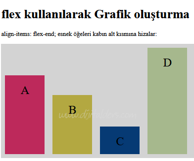
<h1>flex kullanılarak Grafik oluşturma</h1>
<p>align-items: flex-end; esnek öğeleri kabın alt kısmına hizalar:</p>
<div class="flex-container" id="Grafik"></div>
</body>
</html>
<script>
</script>
<html>
<head>
<style>
* {
transation: all 2s;
}
.flex-container {
display: flex;
align-items: flex-end;
background-color: lightgrey;
}
.flex-container > div {
background-color: #f1f1f1;
width: 100px;
margin: 10px;
text-align: center;
line-height: 75px;
font-size: 30px;
}
transation: all 2s;
}
.flex-container {
display: flex;
align-items: flex-end;
background-color: lightgrey;
}
.flex-container > div {
background-color: #f1f1f1;
width: 100px;
margin: 10px;
text-align: center;
line-height: 75px;
font-size: 30px;
}
</style>
</head>
<body>
<h1>flex kullanılarak Grafik oluşturma</h1>
<p>align-items: flex-end; esnek öğeleri kabın alt kısmına hizalar:</p>
<div class="flex-container" id="Grafik"></div>
</body>
</html>
<script>
const liste = {
bir:{renk:'red', boy:200, metin:'A'},
iki:{renk:'green', boy:150, metin:'B'},
uc:{renk:'blue', boy:70, metin:'C'},
dort:{renk:'black', boy:270, metin:'D'}
};
for (x in liste) {
Renk = 'rgb(' + Math.random()*255 +',' + Math.random()*255 +',' + Math.random()*255 + ')';
document.getElementById("Grafik").innerHTML+='<div style="height:' + liste[x].boy + 'px; background-color:' + Renk + '">' + liste[x].metin + "</div>";
}
</script>
Örnek 2
<!DOCTYPE html>
<html>
<head>
<style>
.flex-container {
display: flex;
/*align-items: stretch;*/
background-color: #green;
padding:10px;
}
.flex-container > div {
background-color: DodgerBlue;
color: white;
/*margin: 10px;*/
text-align: center;
line-height: 75px;
font-size: 30px;
}
#Resimler div {
width:150px;
height:150px;
background-color:yellow;
border:1px solid green;
margin:10px;
}
.flex-container2 {
display: flex;
align-items: flex-start;
flex-flow: row wrap;
flex-wrap: wrap;
justify-content: space-around;
}
</style>
</head>
<body>
<div class="flex-container">
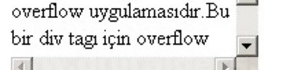
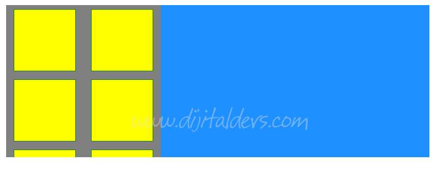
<div style="flex-grow: 2; height:40vh; width:20vw; overflow: auto; background-color:grey">
<div class="flex-container2" id="Resimler">
<div></div>
<div></div>
<div></div>
<div></div>
<div></div>
<div></div>
<div></div>
<div></div>
<div></div>
<div></div>
<div></div>
<div></div>
<div></div>
<div></div>
<div></div>
<div></div>
<div></div>
<div></div>
<div></div>
</div>
</div>
<div style="flex-grow: 8"></div>
</div>
</body>
</html>
<html>
<head>
<style>
.flex-container {
display: flex;
/*align-items: stretch;*/
background-color: #green;
padding:10px;
}
.flex-container > div {
background-color: DodgerBlue;
color: white;
/*margin: 10px;*/
text-align: center;
line-height: 75px;
font-size: 30px;
}
#Resimler div {
width:150px;
height:150px;
background-color:yellow;
border:1px solid green;
margin:10px;
}
.flex-container2 {
display: flex;
align-items: flex-start;
flex-flow: row wrap;
flex-wrap: wrap;
justify-content: space-around;
}
</style>
</head>
<body>
<div class="flex-container">
<div style="flex-grow: 2; height:40vh; width:20vw; overflow: auto; background-color:grey">
<div class="flex-container2" id="Resimler">
<div></div>
<div></div>
<div></div>
<div></div>
<div></div>
<div></div>
<div></div>
<div></div>
<div></div>
<div></div>
<div></div>
<div></div>
<div></div>
<div></div>
<div></div>
<div></div>
<div></div>
<div></div>
<div></div>
</div>
</div>
<div style="flex-grow: 8"></div>
</div>
</body>
</html>