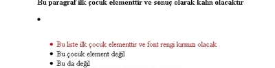
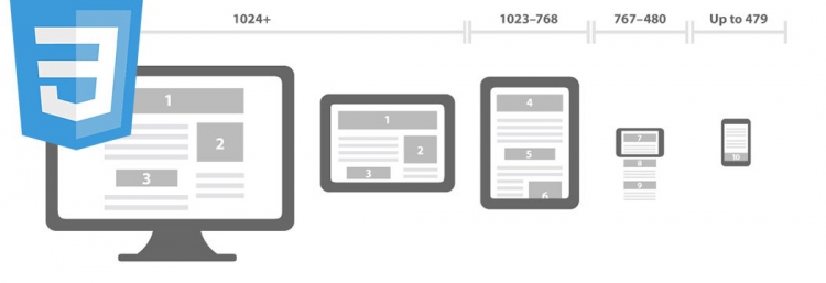
Ekran Çözünürlüğüne Göre CSS Davranışı Belirleme 
@media(max-width:767px){
#logo2 {
background-image: url("/html/tmETicaret1/logo/balimtat.png");
background-repeat: no-repeat;
background-size: 90% 90%;
display: block;
height: 25px;
margin-top: 15px;
overflow: hidden;
text-decoration: none;
text-indent: -1000px;
width: 86px;
}
}
@media(min-width:768px){
#logo2 {
background-image: url("/html/tmETicaret1/logo/balimtat.png");
background-repeat: no-repeat;
display: block;
height: 51px;
margin-top: 5px;
overflow: hidden;
text-decoration: none;
text-indent: -1000px;
width: 173px;
}
}
#logo2 {
background-image: url("/html/tmETicaret1/logo/balimtat.png");
background-repeat: no-repeat;
background-size: 90% 90%;
display: block;
height: 25px;
margin-top: 15px;
overflow: hidden;
text-decoration: none;
text-indent: -1000px;
width: 86px;
}
}
@media(min-width:768px){
#logo2 {
background-image: url("/html/tmETicaret1/logo/balimtat.png");
background-repeat: no-repeat;
display: block;
height: 51px;
margin-top: 5px;
overflow: hidden;
text-decoration: none;
text-indent: -1000px;
width: 173px;
}
}
@media screen and (max-width: 699px) and (min-width: 520px), (min-width: 1151px) {
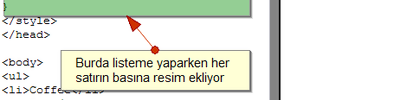
ul li a {
padding-left: 30px;
background: url(email-icon.png) left center no-repeat;
}
}
ul li a {
padding-left: 30px;
background: url(email-icon.png) left center no-repeat;
}
}
@media screen and (max-width: 699px) and (min-width: 520px) {
ul li a {
padding-left: 30px;
background: url(email-icon.png) left center no-repeat;
}
}
ul li a {
padding-left: 30px;
background: url(email-icon.png) left center no-repeat;
}
}
Kaynaklar: