List Tagları ve Css ile Yatay Menü Yapımı
İngilizce bir makaledir.
<div id="menu">
<ul>
<li><h2>CSS Drop Down Menus</h2>
<ul>
<li><a href="http://www.seoconsultants.com/tips/css/#cssmenus" title="SEO Consultants Directory">CSS Hover Navigation</a>
<ul>
<li><a href="http://www.tanfa.co.uk/css/examples/css-dropdown-menus.asp" title="tanfa Introduction">Intro for CSS Enthusiasts</a></li>
<li><a href="http://www.tanfa.co.uk/css/examples/menu/" title="Plain HTML Code">Demonstration HTML</a></li>
<li><a href="http://www.xs4all.nl/~peterned/csshover.html" title="whatever:hover file">csshover.htc file</a></li>
</ul>
</li>
</ul>
</li>
</ul>
<ul>
<li><h2>Vertical CSS Pop-Out Menu</h2>
<ul>
<li><a href="http://www.seoconsultants.com/css/menus/vertical/" title="SEO Consultants Vertical Example">SEO Consultants Sample</a></li>
<li><a href="http://www.tanfa.co.uk/css/examples/menu/vs7.asp" title="Complete Example">tanfa Demo example</a>
<ul>
<li><a href="#">tanfa Tutorial</a><!-- link to seo vertical tut -->
<ul>
<li><a href="http://www.tanfa.co.uk/css/examples/menu/vs1.asp" title="Vertical Menu - Page 1">Stage 1</a></li>
<li><a href="http://www.tanfa.co.uk/css/examples/menu/vs2.asp" title="Vertical Menu - Page 2">Stage 2</a></li>
<li><a href="http://www.tanfa.co.uk/css/examples/menu/vs3.asp" title="Vertical Menu - Page 3">Stage 3</a></li>
<li><a href="http://www.tanfa.co.uk/css/examples/menu/vs4.asp" title="Vertical Menu - Page 4">Stage 4</a></li>
<li><a href="http://www.tanfa.co.uk/css/examples/menu/vs5.asp" title="Vertical Menu - Page 5">Stage 5</a></li>
<li><a href="http://www.tanfa.co.uk/css/examples/menu/vs6.asp" title="Vertical Menu - Page 6">Stage 6</a></li>
</ul>
</li>
</ul>
</li>
</ul>
</li>
</ul>
<ul>
<li><h2>Horizontal Drop & Pop Menu</h2>
<ul>
<li><a href="http://www.seoconsultants.com/css/menus/horizontal/" title="SEO Consultants Directory Example">SEO Consultants Sample</a></li>
<li><a href="http://www.tanfa.co.uk/css/examples/menu/hs7.asp">tanfa Demo example</a><!-- fully working sample -->
<ul>
<li><a href="#">tanfa Tutorial</a><!-- link to horizontal tut -->
<ul>
<li><a href="http://www.tanfa.co.uk/css/examples/menu/hs1.asp" title="Horizontal Menu - Page 1">Stage 1</a></li>
<li><a href="http://www.tanfa.co.uk/css/examples/menu/hs2.asp" title="Horizontal Menu - Page 2">Stage 2</a></li>
<li><a href="http://www.tanfa.co.uk/css/examples/menu/hs3.asp" title="Horizontal Menu - Page 3">Stage 3</a></li>
<li><a href="http://www.tanfa.co.uk/css/examples/menu/hs4.asp" title="Horizontal Menu - Page 4">Stage 4</a></li>
<li><a href="http://www.tanfa.co.uk/css/examples/menu/hs5.asp" title="Horizontal Menu - Page 5">Stage 5</a></li>
<li><a href="http://www.tanfa.co.uk/css/examples/menu/hs6.asp" title="Horizontal Menu - Page 6">Stage 6</a></li>
</ul>
</li>
</ul>
</li>
</ul>
</li>
</ul>
</div>
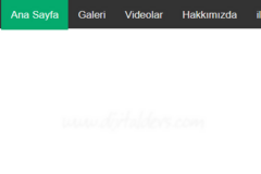
Horizontal and Vertical CSS Menu Tutorial
2005-03-02 - Tutorials provided by Claire from Tanfa
CSS Design, Style and Fun - Musing Over the Possibilities
What follows is an example of how to develop menus similar to the ones shown here and here. This mini-tutorial uses very similar code to cover the main ingredients for both those menus, they can be developed further by adding background images or more color.
Requirements for Both CSS Menus
- Grab the HTML
- Download the whatever:hover file from Peter Nederlof's site.
- Please view any interim samples in a CSS compliant browser (Firefox or Opera), not IE until the fixes at the end are in place.
Note: Anything we do from this point on will not affect text browsers or non CSS parsing applications. It's CSS, it will only affect the visual presentation.
Vertical Pop Out Menu
#menu {
width: 12em; /* set width of menu */
background: #eee;
}

#menu ul { /* remove bullets and list indents */
list-style: none;
margin: 0;
padding: 0;
}

/* style, color and size links and headings to suit */
#menu a, #menu h2 {
font: bold 11px/16px arial, helvetica, sans-serif;
display: block;
border-width: 1px;
border-style: solid;
border-color: #ccc #888 #555 #bbb;
margin: 0;
padding: 2px 3px;
}

#menu h2 {
color: #fff;
background: #000;
text-transform: uppercase;
}

#menu a {
color: #000;
background: #efefef;
text-decoration: none;
}

#menu a:hover {
color: #a00;
background: #fff;
}
The CSS above removes the padding/margin and bullets from all the lists, sets the width of the the entire menu and styles the links and heading to suit.
View the results so far, if you like, remembering to view with a non-IE browser please. Use your back button to come back here.
Positioning the Pop Outs
#menu li {
/* make the list elements a containing block for the nested lists */
position: relative;
}

#menu ul ul ul {
position: absolute;
top: 0;
left: 100%; /* to position them to the right of their containing block */
width: 100%; /* width is based on the containing block */
}
The position: relative; applied to the #menu li makes the <li> elements into containing blocks for the nested <ul> elements.
We only want to apply positioning to tird level nested lists and deeper so the #menu ul ul ul targets that and the popout is positioned over to the right edge of their containing block (parent <li> element)
This now shows all the popouts in their correct position, remember to view with a non-IE browser.
Hiding and Revealing using :hover
div#menu ul ul ul,
div#menu ul ul li:hover ul ul
{display: none;}

div#menu ul ul li:hover ul,
div#menu ul ul ul li:hover ul
{display: block;}
This bit could be simplified with the use of child selectors, unfortunately we have to use more specific descendant selectors in order for IE to understand.
This now achieves what we want, in a non-IE browser.
Fixing it for IE!
<!--[if IE]>
<style type="text/css" media="screen">
body {
behavior: url(csshover.htc); /* call hover behaviour file */
font-size: 100%; /* enable IE to resize em fonts */
}
#menu ul li {
float: left; /* cure IE5.x "whitespace in lists" problem */
width: 100%;
}
#menu ul li a {
height: 1%; /* make links honour display: block; properly */
}

#menu a, #menu h2 {
font: bold 0.7em/1.4em arial, helvetica, sans-serif;
/* if required use em's for IE as it won't resize pixels */
}
</style>
<![endif]-->
The above is the entire conditional CSS which we use to target IE/Windows only. It enables us to call the hover behaviour file and also to input some other IE "workaround" CSS without affecting other browsers.
Providing the csshover.htc file has been saved to the same directory as the file you're working on you should see that the popouts are now appearing on hover as expected.
The complete code now looks like this, you can now view and admire your work.
Horizontal CSS Dropdown and Popout Menu
#menu {
width: 100%;
background: #eee;
float: left;
}
#menu ul {
list-style: none;
margin: 0;
padding: 0;
width: 12em;
float: left;
}
The above sets the width onto the individual lists, <ul>'s, this time as the need to float side by side to make them fit into whatever horizontal space is available to them. This horizontal width is determined by setting the width of the #menu div itself. The #menu div is also floated in order to "contain" it's floated descendants.
Then we apply the required formatting to the <h2> headings and the <a> anchors, again I'm using the same formatting as the vertical menu
#menu a, #menu h2 {
font: bold 11px/16px arial, helvetica, sans-serif;
display: block;
border-width: 1px;
border-style: solid;
border-color: #ccc #888 #555 #bbb;
margin: 0;
padding: 2px 3px;
}

#menu h2 {
color: #fff;
background: #000;
text-transform: uppercase;
}

#menu a {
color: #000;
background: #efefef;
text-decoration: none;
}

#menu a:hover {
color: #a00;
background: #fff;
}
Color to taste.
Positioning the Popout Menus and Dropdown Menus
#menu li {position: relative;}

#menu ul ul {
position: absolute;
z-index: 500;
}

#menu ul ul ul {
top: 0;
left: 100%;
}
The position: relative; on the <li> elements establish containing blocks for the descendant <ul> elements.
All secondary levels and deeper are given position: absolute; and a high z-index in order to make them appear, drop down above following content. the third level and deeper lists are the ones we want to move so "offset" positioning co-ordinates only required to be input onto them.
Hiding and Revealing using :hover
This time we actually do want to hide the second level menu (top choice) as we only want the <h2> heading, inside the top level <ul> to remain visible.
div#menu ul ul,
div#menu ul li:hover ul ul,
div#menu ul ul li:hover ul ul
{display: none;}

div#menu ul li:hover ul,
div#menu ul ul li:hover ul,
div#menu ul ul ul li:hover ul
{display: block;}
The display: block; rules show the three levels being activated with the display: none; rules being entered afterwards to more specifically hide the unwanted (deeper nested) lists (counteract them).
Fix it for IE!
The complete conditional CSS is the same as the vertical menu's code and looks like this:
<!--[if IE]>
<style type="text/css" media="screen">
body {
behavior: url(csshover.htc);
font-size: 100%;
}

#menu ul li {float: left; width: 100%;}
#menu ul li a {height: 1%;}

#menu a, #menu h2 {
font: bold 0.7em/1.4em arial, helvetica, sans-serif;
}
</style>
<![endif]-->
The complete CSS Horizontal Menu example.
Summary
So that's it there has been some nuances left out like background images etc.. But the basics of hover, positioning and getting it to be resizable and compatible with IE/Windows 5+, (sorry won't work in IE/Mac) were the major requirements here.
What we have here is the bare bones of any particular style of dropdown you would like to create, background images, extra class names etc. an be used to spice it up, but most of all the HTML has remained clean throughout meaning it's very accessible to all UA's and Search Engine spiders.
The other main thing I would say is that please always develop in a non-IE environment as IE workarounds are unfortunately as necessary as CSS hacks were a couple of years ago. I hope you see that CSS driven menus are firmly within our grasp because we can work around IE quite easily thanks to well known research into it's foibles in the last few years.
There is a technical introduction covering both versions as well as a more detailed tutorial for each menu on tanfa CSS site, for those that want to know more about the "hows and whys".