Gölge Efekti 
Css 3 ile birlikte kolaylaşan gölgelendir efekti işlemleri

<img src="http://bavotasan.com/wp-content/uploads/2010/12/lighbulb.jpg" alt="lighbulb" width="200" height="150" />
</a>
position: relative;
max-width: 100%;
float: left;
}
.img-shadow::before {
content: "";
position: absolute;
top: 0;
bottom: 0;
left: 0;
right: 0;
box-shadow: inset 0 0 8px rgba(0,0,0,.6);
-moz-box-shadow: inset 0 0 8px rgba(0,0,0,.6);
-webkit-box-shadow: inset 0 0 8px rgba(0,0,0,.6);
}
.img-shadow img {
float: left;
}
<a class="shadow"><img src="/path/to/your/image.jpg" /></a>
</div>
padding:10px;
background-color:#ccc;
}
.shadow{
display:block;
position:relative;
}
.shadow img{
display:block;
}
.shadow::before{
display:block;
content:'';
position:absolute;
width:100%;
height:100%;
-moz-box-shadow:inset 0px 0px 3px 1px rgba(0,0,0,0.2);
-webkit-box-shadow:inset 0px 0px 3px 1px rgba(0,0,0,0.2);
box-shadow:inset 0px 0px 3px 1px rgba(0,0,0,0.2);
}
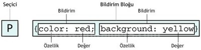
Box-Shadow
Box-shadows are probably the most common type of CSS shadows. The potential uses here are incredibly diverse and developers have come up with all kinds of crazy awesome applications. The box-shadow syntax is actually fairly complex and includes six separate values. We’ll start off by taking a look at five of the most common of these.
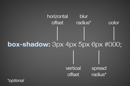
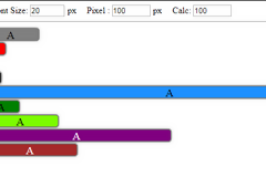
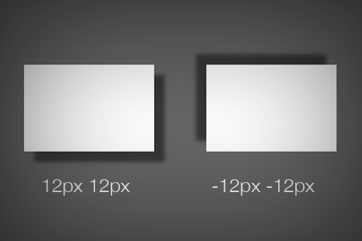
As you can see, listed above in order, the order of values is horizontal offset, vertical offset, blur radius, spread radius and color. The first two values, horizontal and vertical offset, are fairly straightforward. Positive values will push the shadow right and downward respectively and negative values will push the shadow left and upwards. Here’s an example of both:
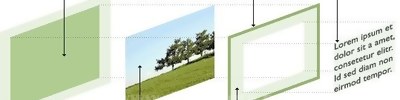
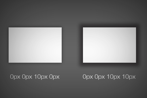
The latter two values, blur radius and spread radius are a bit more complicated. The biggest question that you might have is, what’s the difference? To answer this, let’s first look at the one that you’re probably the most familiar with: blur radius.
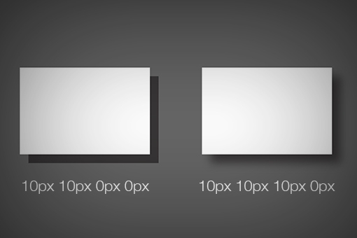
As you can see, no blur radius produces a shadow with a hard edge and a high blur radius produces a blurry edge. Pretty simple right? So what about the spread radius then? How does that differ? A picture is worth a thousand words so here’s an example:
As you can see, without affecting how blurry the shadow is, the spread of the shadow essentially grows and shrinks the surface area occupied by the shadow. If you thought of it as the size of the shadow, you wouldn’t be too far off.
If you leave off either the blur or spread radius, their values will default to zero. Looking around the web, you’re likely to see that most demos that you come across, including those on Design Shack, have no spread radius defined. Also note that the -webkit prefixed version of box-shadow is often still added to ensure browser compatibility when using box-shadow.
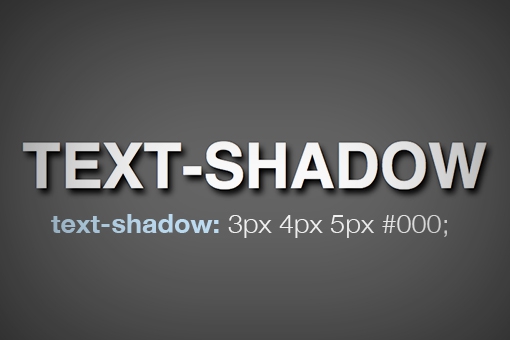
Text Shadow
Now that we have a solid understanding of how the box-shadow syntax works, we can take a look at the syntax for the other type of CSS shadow: the text-shadow. Fortunately, this syntax is even simpler than that for box-shadow.
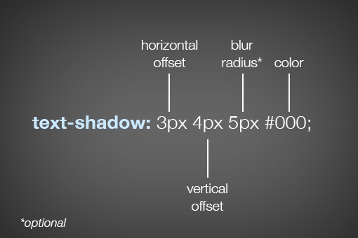
As you can see, most of the values are the same here, so if you understand one, you understand the other. Interestingly enough though, you don’t have access to a shadow’s spread with text-shadow. It would be great if you did, but unfortunately the feature simply isn’t there.
Inset Box-Shadows
All righty, now that we’ve laid a basic foundation and you completely understand CSS shadow syntax, it’s time to jump into creating “inner” or “inset” shadows. To shift a shadow to an inset shadow, all we really need to do is add a single word, “inset.”
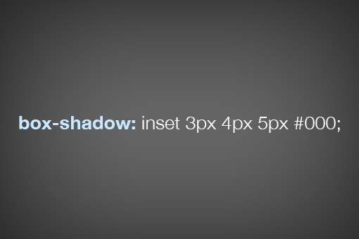
This is why we started with the basic syntax. As a whole, the box-shadow chunk of code can look pretty intimidating, but if you break it down as we have done, it’s actually really simple.
All of the values here essentially perform the same way, only the shadow is placed inside of the box. Here we can see how the spread of a shadow can still have a big impact on how the shadow looks:
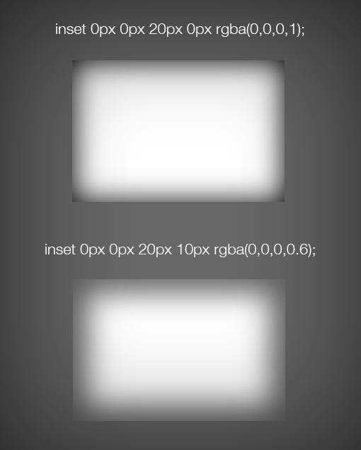
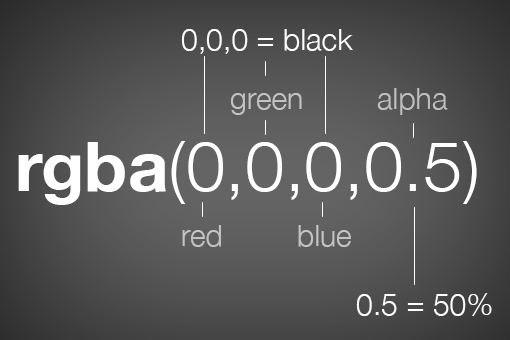
Notice that this time I actually used RGBa color instead of a hex value. This is great for shadows because the alpha value provides a quick and easy way to lighten or darken the shadow.
With Images
It’s easy enough to throw a box-shadow onto an empty div, but what if you want to place one on an image. It sounds simple, but the reality is a little tricky. Let’s look at some code and its ultimate effect. We’ll begin with an plain old image tag.
|
1
|
|
Now we’ll target this in our CSS and add an inset box-shadow. You’d think that something like this would work:
|
1
2
3
|
img { box-shadow: inset 0px 0px 10px rgba(0,0,0,0.5);} |
Unfortunately, this gives us the following result. The picture is working fine, but the shadow isn’t visible!
So how do we pull off an inner shadow on an image? There are quite a few different ways to do it, all of which have their pros and cons. Let’s take a look at two popular solutions.
The first solution is to wrap the image in a div that’s constrained to the same size as the image, then set the shadow to that div while using some relative positioning and z-index voodoo on the image itself. Here’s what that looks like in code:
|
1
2
3
|
|
01
02
03
04
05
06
07
08
09
10
11
12
|
div { height: 200px; width: 400px; box-shadow: inset 0px 0px 10px rgba(0,0,0,0.9);}img { height: 200px; width: 400px; position: relative; z-index: -2;} |

This solution is workable, but it involves a little extra markup and quite a bit of extra CSS. As an alternative, you could simply drop the HTML image and insert a background image via CSS. Using this method, the image doesn’t cover up the shadow but instead is placed under it by default.
|
1
2
3
|
<div> <!-- just an empty div --></div> |
|
1
2
3
4
5
6
|
div { height: 200px; width: 400px; box-shadow: inset 0px 0px 10px rgba(0,0,0,0.9);} |

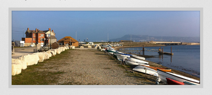
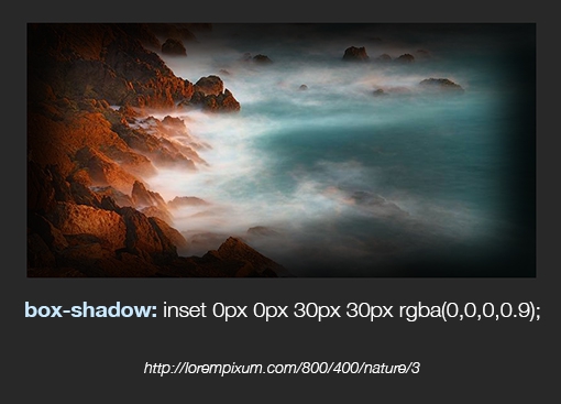
If we combine these techniques with a heavy spread, we can achieve a pretty dramatic image vignette effect using only CSS.
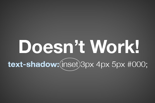
Inset Text-Shadows
Even at their most complex, inset box-shadows are pretty easy to wrap your mind around. Toss in the word “inset” and your drop shadow becomes an inner shadow. Super simple.
Unfortunately, text-shadow gives us a lot more trouble here. The “inset” value isn’t compatible with text-shadow so something like this simply won’t work:
Instead, we have to hack it together. How it works is pretty bizarre so we’ll build it in two steps so that you can see what’s happening. First, we’re going to type out an h1 and apply the following styles:
|
1
2
3
4
5
|
h1 { background-color: #565656; color: transparent; text-shadow: 0px 2px 3px rgba(255,255,255,0.5);} |
Already we’re in some weird territory. We’ve set a dark background color, a white text-shadow and a fill color of transparent. If you think that’s weird, check out the result:

This isn’t what we want at all! Interestingly enough, we’re off to the perfect start. The secret ingredient to make everything work is the “background-clip” property with the value set to “text.”
|
1
2
3
4
5
6
7
8
|
h1 { background-color: #565656; color: transparent; text-shadow: 0px 2px 3px rgba(255,255,255,0.5); -webkit-background-clip: text; -moz-background-clip: text; background-clip: text;} |
By setting the background-clip property to text, we can effectively clip anything going on in the background (images, gradients, colors, etc.) to the bounds of the text. When we do that with the code that we already had set up, this is the result:

As you can see, we’ve pulled off a really nice letterpress effect. That blurry edge is being cropped and now creates the illusion of an inset shadow. Meanwhile, the white text-shadow is providing us with the degree of lightness for the background fill and a little bevel effect outside the text. If we bump that shadow from 0.5 to 03., the text gets darker.

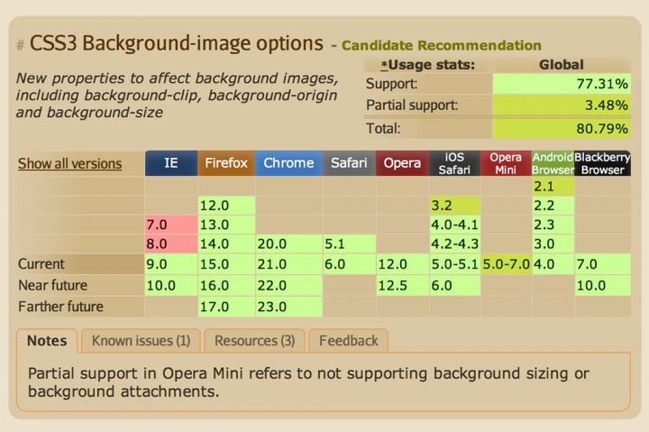
Browser Support
If you’re going to go around using weird properties like background-clip, you should definitely know where they will and won’t work. As always with browser support, I’ll turn to CanIUse for the answer.
Kaynaklar
- http://bavotasan.com/2011/adding-inset-shadow-to-image-css3/
- http://designshack.net/articles/css/inner-shadows-in-css-images-text-and-beyond/