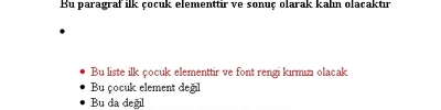
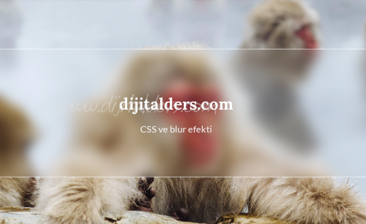
CSS ile Blur Efekti 
HTML Kod
<div class="widget center">
<div class="blur"></div>
<div class="text center">
<h1 class="">dijitalders.com</h1>
<p>CSS ve blur efekti</p>
</div>
</div>
<div class="blur"></div>
<div class="text center">
<h1 class="">dijitalders.com</h1>
<p>CSS ve blur efekti</p>
</div>
</div>
CSS kodu
body {
background: url('https://images.unsplash.com/photo-1486723312829-f32b4a25211b?dpr=2&auto=format&fit=crop&w=1500&h=1000&q=80&cs=tinysrgb&crop=&bg=') no-repeat center center fixed;
background-size: cover;
}
.blur {
background: url('https://images.unsplash.com/photo-1486723312829-f32b4a25211b?dpr=2&auto=format&fit=crop&w=1500&h=1000&q=80&cs=tinysrgb&crop=&bg=') no-repeat center center fixed;
background-size: cover;
overflow: hidden;
filter: blur(13px);
position: absolute;
height: 400px;
top: -50px;
left: -50px;
right: -50px;
bottom: -50px;
}
.widget {
border-top: 2px solid rgba(255, 255, 255, .5);
border-bottom: 2px solid rgba(255, 255, 255, .5);
height: 300px;
width: 100%;
overflow: hidden;
}
.center {
position: absolute;
margin: auto;
top: 0;
bottom: 0;
left: 0;
right: 0;
}
/* bundan sonrası blur efekti ile ilgili değil */
.text {
height: 200px;
width: 340px;
}
.text h1 {
text-align: center;
text-shadow: 1px 1px rgba(0, 0, 0, .1);
color: #ffffff;
margin-top: 57px;
font-family: 'Lora', serif;
font-weight: 700;
font-size: 38px;
}
.text p {
text-align: center;
color: #ffffff;
text-shadow: 1px 1px rgba(0, 0, 0, .1);
margin-top: 0px;
font-family: 'Lato', serif;
font-weight: 400;
font-size: 22px;
}
background: url('https://images.unsplash.com/photo-1486723312829-f32b4a25211b?dpr=2&auto=format&fit=crop&w=1500&h=1000&q=80&cs=tinysrgb&crop=&bg=') no-repeat center center fixed;
background-size: cover;
}
.blur {
background: url('https://images.unsplash.com/photo-1486723312829-f32b4a25211b?dpr=2&auto=format&fit=crop&w=1500&h=1000&q=80&cs=tinysrgb&crop=&bg=') no-repeat center center fixed;
background-size: cover;
overflow: hidden;
filter: blur(13px);
position: absolute;
height: 400px;
top: -50px;
left: -50px;
right: -50px;
bottom: -50px;
}
.widget {
border-top: 2px solid rgba(255, 255, 255, .5);
border-bottom: 2px solid rgba(255, 255, 255, .5);
height: 300px;
width: 100%;
overflow: hidden;
}
.center {
position: absolute;
margin: auto;
top: 0;
bottom: 0;
left: 0;
right: 0;
}
/* bundan sonrası blur efekti ile ilgili değil */
.text {
height: 200px;
width: 340px;
}
.text h1 {
text-align: center;
text-shadow: 1px 1px rgba(0, 0, 0, .1);
color: #ffffff;
margin-top: 57px;
font-family: 'Lora', serif;
font-weight: 700;
font-size: 38px;
}
.text p {
text-align: center;
color: #ffffff;
text-shadow: 1px 1px rgba(0, 0, 0, .1);
margin-top: 0px;
font-family: 'Lato', serif;
font-weight: 400;
font-size: 22px;
}