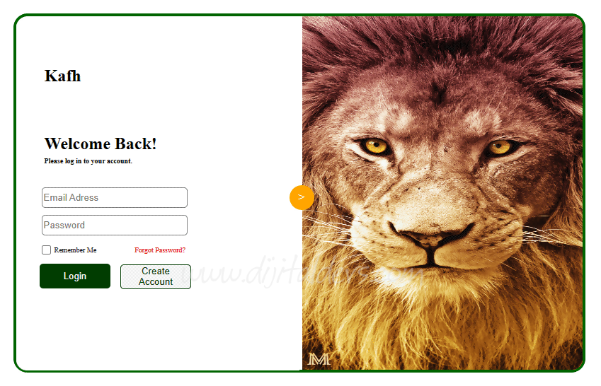
Giriş (Login) Tasarımları
Örnek 1
<!DOCTYPE html>
<html lang="en">
<head>
<meta charset="UTF-8">
<meta name="viewport" content="width=device-width, initial-scale=1.0">
<title>Document</title>
<style>
@media screen and (max-width:620px){
img {display: none !important;}
#turuncu {display: none !important;}
#ilkyari{
bottom: 0px !important;
}
#container{ width: 400px !important;}
#login{
right: -150px !important;
}
#crate{
top: 15px !important;
right: -15px !important;
}
}
#container{
width: 800px;
height: 500px;
background-color: white;
border: 4px solid darkgreen;
border-radius:20px ;
margin: 0 auto;
margin-top: calc((100vh - 500px) / 2);
}
#ilkyari{
background-color: rgb(255, 255, 255);
width:50%;
height: 100%;
display: inline-block;
position: relative;
bottom: 278px;
border-radius: 15px 0 0 15px;
}
#ikinciyari{
background-color: rgb(255, 145, 0);
width:49.5%;
height: 100%;
display: inline-block;
position: relative;
border-radius: 0 15px 15px 0;
}
.giris{
position: relative; left: 16px; border-radius: 5px; border: gray 1px solid;
width: 200px;
height: 25px;
}
#login{
border-radius: 5px;
border: none;
width: 100px;
height: 35px;
position: relative;
top:50px;
right: 150px;
}
#crate{
position:relative;
width: 100px;
height: 35px;
top:43px;
right: 140px;
border-radius: 5px;
}
#girisblogu{
position: relative;
top: 100px;
left: 20px;
}
#turuncu{
border-radius: 50%;
background-color: orange;
width: 35px;
height: 35px;
position: relative;
bottom: 540px;
left: 386px;
display: flex;
justify-content: center;
align-items: center;
color: white;
}
</style>
</head>
<body>
<div id="container">
<div id="ilkyari">
<div id="girisblogu">
<h2 style="position: relative; left: 20px; bottom: 50px;"> Kafh</h2>
<h2 style="position: relative; left: 20px;"> Welcome Back!</h2>
<h5 style="position: relative; left: 20px; bottom: 15px;font-size: 10px;"> Please log in to your account.</h5>
<input class="giris" type="email" placeholder="Email Adress"> <br>
<input class="giris" style="top:10px" type="password" placeholder="Password"> <br>
<input style="position: relative; top: 15px; left: 12px;" type="checkbox"> <span style="position: relative; top: 12px;left: 10px; font-size: 10px;">Remember Me</span>
<span style="position: relative; top: 12px;left: 60px; font-size: 10px; color: red;">Forgot Password?</span>
<button id="login" style="background-color: rgb(1, 61, 1);color: white;">Login</button>
<button id="crate" style="border: 1px solid rgb(1, 61, 1);color: rgb(1, 61, 1);">Create Account</button>
</div>
</div>
<img id="ikinciyari" src="aslan.jpg" alt="">
<div id="turuncu">></div>
</div>
</body>
</html>
Örnek 2
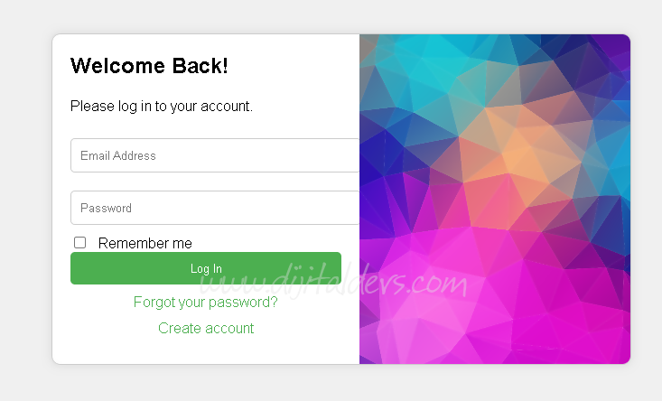
<!DOCTYPE html>
<html>
<head>
<style>
body {
font-family: Arial, sans-serif;
display: flex;
justify-content: center;
align-items: center;
height: 100vh;
margin: 0;
background-color: #f0f0f0;
}
.container {
display: flex;
background-color: white;
border: 1px solid #ccc;
border-radius: 10px;
overflow: hidden;
box-shadow: 0 0 10px rgba(0, 0, 0, 0.1);
}
.form-container {
padding: 20px;
width: 300px;
}
.form-container h2 {
margin: 0 0 20px;
}
.form-container input[type="email"],
.form-container input[type="password"] {
width: 100%;
padding: 10px;
margin: 10px 0;
border: 1px solid #ccc;
border-radius: 5px;
}
.form-container input[type="checkbox"] {
margin-right: 10px;
}
.form-container button {
width: 100%;
padding: 10px;
background-color: #4CAF50;
color: white;
border: none;
border-radius: 5px;
cursor: pointer;
}
.form-container button:hover {
background-color: #45a049;
}
.form-container .link {
display: block;
margin: 10px 0;
text-align: center;
color: #4CAF50;
text-decoration: none;
}
.image-container {
background-image: url('2.png');
background-size: cover;
background-position: center;
width: 300px;
}
</style>
</head>
<body>
<div class="container">
<div class="form-container">
<h2>Welcome Back!</h2>
<p>Please log in to your account.</p>
<input type="email" placeholder="Email Address" required>
<input type="password" placeholder="Password" required>
<div>
<input type="checkbox" id="remember">
<label for="remember">Remember me</label>
</div>
<button>Log In</button>
<a href="#" class="link">Forgot your password?</a>
<a href="#" class="link">Create account</a>
</div>
<div class="image-container"></div>
</div>
</body>
</html>
Yorumunuzu Ekleyin