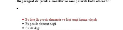
CSS'de Değişken Kullanımı
Örnek
<!DOCTYPE html>
<html>
<head>
<meta name="viewport" content="width=device-width, initial-scale=1">
<style>
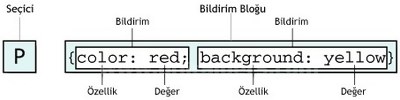
:root {
primary-bg-color: #1e90ff;
primary-color: #ffffff;
}
body {
background-color: varprimary-bg-color);
}
.container {
fontsize: 20px;
color: varprimary-bg-color);
background-color: varprimary-color);
padding: 15px;
font-size: varfontsize);
}
.container h2 {
border-bottom: 2px solid varprimary-bg-color);
}
@media screen and (min-width: 450px) {
.container {
fontsize: 40px;
}
:root {
primary-bg-color: lightblue;
}
}
</style>
</head>
<body>
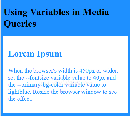
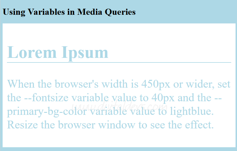
<h1>Using Variables in Media Queries</h1>
<div class="container">
<h2>Lorem Ipsum</h2>
<p>When the browser's width is 450px or wider, set the fontsize variable value to 40px and the primary-bg-color variable value to lightblue. Resize the browser window to see the effect.</p>
</div>
</body>
</html>